Ever land on a page where everything feels like it’s shouting at you in the same voice? Problem is, when that’s the case, nothing is actually heard.
That’s what happens when there’s no hierarchy.
Let’s take a look at this simple example layout I snagged from my website:

Everything looks the same, right? With no visual cues and totally even spacing, your eye doesn’t know where to land first. The message feels flat and easy to skip.
Let’s make a few adjustments and we’ll see the positive results of designing with proper hierarchy in play.
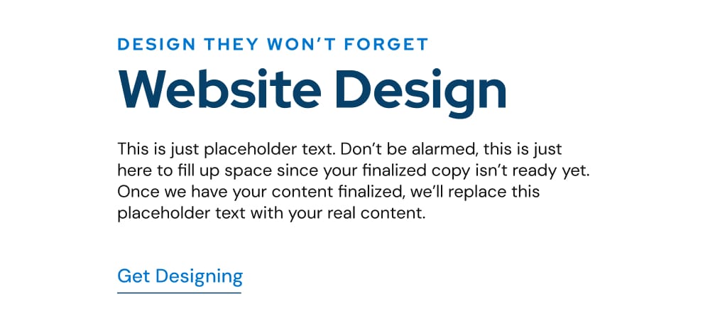
With the changes in place as seen in the image above, you can now clearly see the hierarchy of the content.
The subheading is smaller and styled with an accent color. The heading takes center stage with size and weight. The button looks like a button, ready to be clicked. Even the spacing is intentional, giving each element room to breathe and grouped properly.

That’s hierarchy: using size, color, and spacing to guide the user’s eye. Good hierarchy helps people know what to read first, what action to take, and how the content connects together.
Without it, everything blurs together. With it, the design feels effortless.
Take a look at your site, ask yourself: does my design show what’s most important at a glance? Are users able to scroll quickly and digest the content?
When hierarchy works, visitors don’t just read your site — they move through it the way you intended.
See you next time,
