
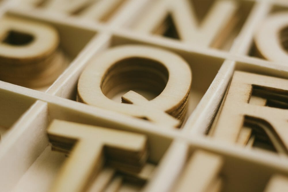
Ty•pog•ra•phy (noun): the style and appearance of printed matter; the art or procedure of arranging type or processing data and printing from it.
Typography is one of the most important elements of design. How you treat typography can dictate the overall outcome of any project. Within the umbrella of typography, there are various components that make up its entirety:
- Typefaces
- Kerning
- Leading
- Tracking
- Hierarchy
Typefaces
5 Epic Font Pairings You Can’t Go Wrong With
Tired of searching for fonts? With my 10+ years of design experience, I’ve put together the best font pairings for you to use, where to find them, and what industry they’re best for.
Get the Free Guide
A typeface is a designed set of letters, numbers, and/or symbols. Within a typeface, there most often are several variations (bold, italic, thin, etc.) which are the individual fonts.
Let’s take a look below at the typeface Futura Std. As you’ll notice, there are several variations in this typeface: light, book, medium, heavy, bold, extra bold. Each of these individual variations are considered fonts.

Depending on what typeface you use, and even specifically what font, will greatly influence your design. There are many factors to consider, like who your audience is, the company’s branding, the specific project specs, and so on.
Let’s compare two email designs (done by AWD), with two totally different designs. The design on the left is for a skin care company, whereas the one on the right is for a rustic Italian restaurant.

The skin care company email features two different typefaces, DIN (sans-serif) and Bauer Bodoni (serif). The combination of the fonts creates a more elegant look, which directly relates to their high-end clientele.
The restaurant email also includes two different typefaces, Old Style (serif) and Gill Sans MT (sans-serif). The Old Style font brings in the rustic and charming aesthetic of the restaurant, while the Gill Sans MT font balances it out with a clean and simple look.
Kerning, leading, and tracking
These three settings are used when setting up your body of text. Kerning is when you change the spacing between two individual letters. Tracking is the amount of space between all letters within a word. Leading, also known as line-spacing, is the distance between lines of text. Below, we look at the visuals of each.

Hierarchy
When laying out your text, paying attention to hierarchy is crucial. The first example that comes to mind is a newspaper layout. No matter what, the biggest and most important story is on the front page. How can you tell? There most often is a large image and extra large text to accompany it. This large heading draws you in to read that first, because it stands out the most.
Below, we have an example from the Los Angeles Times. This excerpt is specifically from the Sports section. As you browse, you can easily notice what story is most important, and also what other stories are on the page. Additionally, you’ll see that below each headline, is a subhead. This is noted with smaller font, although it’s still larger than the body copy. This allows you to read the headline, then the subhead, and then the article.
Typography is powerful
Although a very short lesson indeed, these few details will show you how many elements go into utilizing typography. All of them together must be considered when creating any sort of design, article, blog, etc. Any one element that’s not considered could easily alter your message. So take note, and always remember the importance of typography.