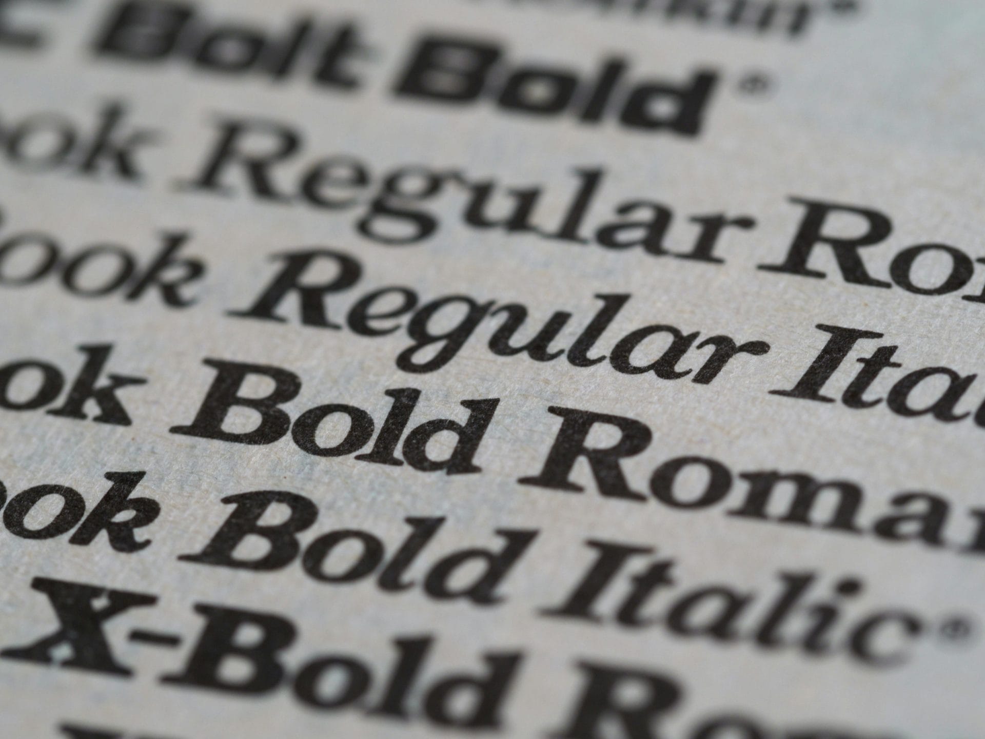
Fonts, fonts, fonts.
There’s quite literally hundreds of thousands of them in existence — some good, some not so much.
So, with so many options out there, how do you choose a font for your project? Whether you’re trying to be fun and quirky, or serious and modern, there’s a font for that.
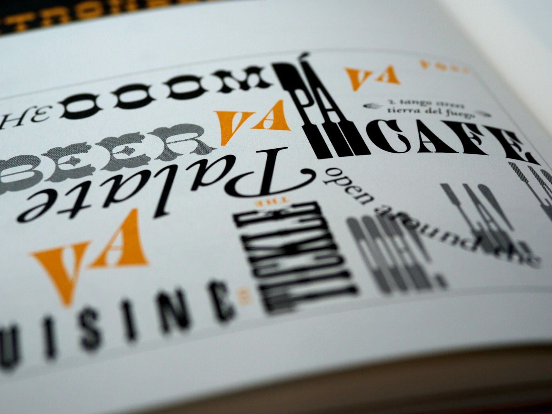
Without further ado, here’s our top 5 fonts you could consider for your designs in 2023.
5 Epic Font Pairings You Can’t Go Wrong With
Tired of searching for fonts? With my 10+ years of design experience, I’ve put together the best font pairings for you to use, where to find them, and what industry they’re best for.
Get the Free Guide
FONT 1:

Right out of the gate, one of our favorite sans-serif fonts for designing is Proxima Nova. This versatile font consists of 14 different font families, ranging from ‘Thin’ to ‘Black’. As a result, this is an excellent font for using in just about any style of design. Use the ‘Thin’ variation for a dainty, feminine feel, or go extra bold with the ‘Black’ variation and make a statement. Either way, you can’t really go wrong with Proxima Nova.
FONT 2:

As a contrast to the first font choice, Neuton carries strong serifs and a little more character. This font is great for body copy, but at not too small of a scale (nothing below 10pt., preferably). This font comes with a reasonable 7 font families, from ‘Extra Light’ to ‘Extra Bold’. The only downfall? There’s no italic font family, however this shouldn’t hold you back from using it to enhance your designs.
FONT 3:

This sans-serif font has similar features to Proxima Nova, except it’s a bit more straightforward. If you’re looking for a clean, easy to read font — this is what you’ll use. With 12 font families to choose from, including obliques (italics), you’ll have the flexibility to cater the font to your design needs. Headers, body copy, subheads — Avenir LT Std will do it all for you.
FONT 4:

This ultra-serif font, Playfair Display, is simply stunning. Used best as primarily in large font sizes, this font can make your design really stand out. What we love most is the bold, italic font family which really brings the font design to life. Playfair Display has a respectable 6 font families, which is pretty uncommon for such a stylized serif font. Don’t ever count out this font for your next project.
FONT 5:

To give an extra flair to your designs, look into Northwell for your next font choice. Featuring a cursive, hand-drawn-like appearance, we love the personal touch it adds. This font comes with just two font families, however we still think it’s a strong contender with today’s design trends. Heads above other handwritten fonts to compare it to, Northwell is beautifully designed and will enhance any project you decide to use it on.
We wish you a successful year and look forward to new and inspiring fonts!